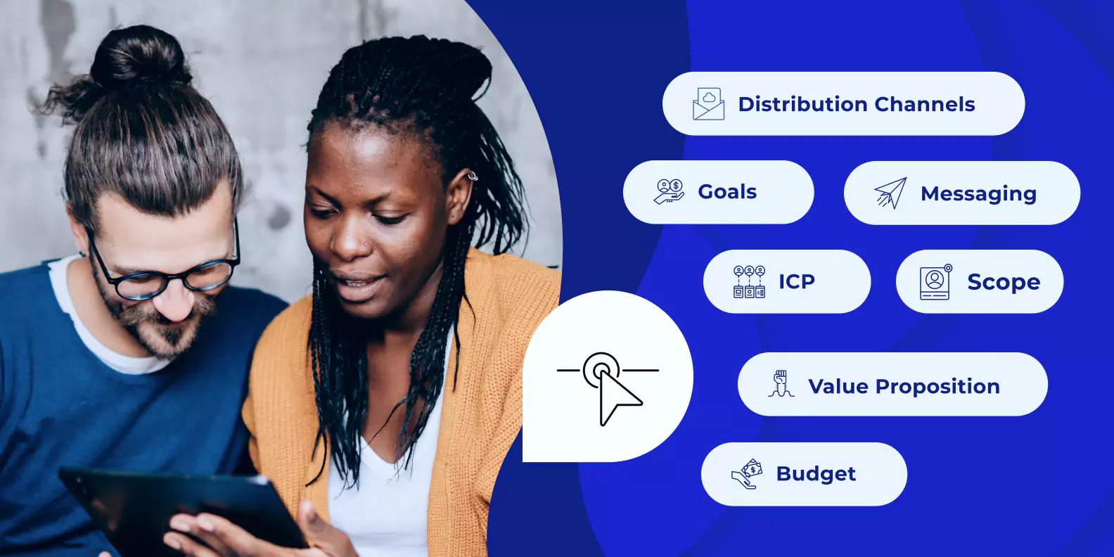
 When it comes to digital marketing campaigns, landing pages are like the front door that greets potential customers and guides them towards taking actions that we want them to. Creating landing pages that effectively engage and convert requires careful planning, strategic thinking, and creative execution. And at the heart of this process lies the importance of descriptive creative briefs. In this blog, we will delve into the significance of descriptive creative briefs in the context of landing page creation and strategy. We will explore how briefs enable marketers to develop landing pages that resonate with their target audience, convey key messages effectively, and drive conversions. Let’s discover why descriptive creative briefs are essential tools for crafting impactful landing pages and strategies. The Components of a Descriptive Creative BriefA descriptive landing page brief is a roadmap for creating landing pages that aligns with the overarching marketing strategy. Effective briefs outline the key elements to develop a compelling landing page and ensure clarity, consistency, and alignment with the brand’s objectives. A comprehensive brief typically includes the following components: Objective: Clearly define the purpose of the landing page, whether it is to generate leads, drive sales, promote a specific offer, or encourage newsletter sign-ups. This objective acts as a guiding principle throughout the creation process. Target Audience: Identify the specific target audience you want to interact with the landing page. Understand their demographics, preferences, pain points, and motivations to tailor the content and design elements accordingly. Key Messages: Determine the core messages that must be communicated to the audience. These messages should align with the brand voice and marketing strategy, highlighting the unique value proposition and addressing customer needs. Call-to-Action (CTA): Define the desired action you want visitors to take on the landing page, such as filling out a form, purchasing, or subscribing to a service. The CTA should be compelling, visually prominent, and strategically placed to maximize conversions. Content Guidelines: Outline the type of content to include on the landing page, such as headlines, subheadings, body copy, bullet points, testimonials, and social proof. Specify the tone of voice, messaging style, and any critical information that should be highlighted. Why Descriptive Creative Briefs Matter for Landing PagesNow that we’ve reviewed what descriptive creative briefs for landing pages should contain, let’s talk about something else: why they’re important for your team and your marketing goals. These briefs serve as a central reference point, ensuring everyone is on the same page regarding objectives, target audience, messaging, and design. They also foster effective collaboration and streamline workflows by providing guidelines for design, content, and brand consistency. Not to mention, if you work remotely or asynchronously, they can be key to keeping a project moving across timezones. But, these aren’t the only benefits. Having a descriptive creative brief can also lead to… Alignment and Consistency: Descriptive creative briefs align the landing page with the marketing strategy. They clearly understand the campaign objectives, target audience, messaging, and design guidelines. Marketers can create a seamless user experience that reinforces the brand’s identity and value proposition by ensuring consistency across various touchpoints. Clarity and Focus: A well-crafted brief helps eliminate ambiguity and ensures the landing page focuses on its intended purpose. It guides content creators and designers, preventing unnecessary clutter and distractions that may dilute the page’s impact. With a clear direction, the landing page can communicate the desired messages effectively, resulting in higher engagement and conversions. Audience-Centric Approach: Understanding the target audience is vital for creating landing pages that resonate with their needs and desires. A descriptive creative brief prompts marketers to conduct thorough audience research, enabling them to tailor the content and design elements specifically to the preferences and pain points of the target audience. By speaking directly to their interests and concerns, landing pages become more persuasive and compelling. Optimization for Conversion: Landing pages are ultimately designed to drive conversions. A descriptive creative brief allows marketers to define the desired action and optimize the page’s elements for conversion success. From the placement and design of the CTA to the persuasive copywriting and visual hierarchy, every aspect can be strategically crafted to encourage visitors to take the desired action. Creating an Effective Landing Page StrategyDeveloping a successful landing page strategy goes hand in hand with creating descriptive creative briefs. A comprehensive strategy ensures that landing pages align with the overall marketing goals and are seamlessly integrated into the customer journey. Here are vital steps to consider when crafting a landing page strategy: Define Campaign Objectives: Clearly outline the marketing campaign’s objectives and the role landing pages will play in achieving those objectives. Identify key metrics to track and measure the success of the landing pages. Conduct Audience Research: Deeply understand the target audience’s needs, motivations, pain points, and preferences. Utilize this knowledge to develop landing pages that resonate with their needs and desires. Map the Customer Journey: Visualize the journey from the initial touchpoint to the landing page and beyond. Identify where the landing page fits into the larger conversion funnel and ensure a seamless transition for visitors. Implement A/B Testing: Leverage A/B testing to optimize landing page performance. Test different variations of elements such as headlines, CTAs, visuals, and layout to identify the most effective combination for achieving the desired conversions. Monitor and Analyze: Continuously monitor landing page performance using web analytics tools. Measure critical metrics such as conversion rates, bounce rates, and time on page to identify areas for improvement and make data-driven optimizations. In digital marketing, landing pages are crucial touchpoints that can make or break a campaign’s success. To ensure their effectiveness, descriptive creative briefs are invaluable tools, guiding marketers through crafting compelling landing pages and strategies. These briefs bring clarity, alignment, and focus to the creative process, allowing marketers to create landing pages that resonate with their target audience, convey key messages effectively, and drive conversions. By investing time and effort in developing comprehensive creative briefs, marketers can elevate their landing page game and maximize the ROI of their digital marketing campaigns. So, let descriptive creative briefs be your compass as you create impactful landing pages that captivate and convert. To simplify your life, we’ve compiled this editable PDF of a detailed creative brief landing page; get your blueprint for stellar landing pages here! Better landing pages = higher ROASLooking for an easier way to build high-performing landing pages at scale and get more from your advertising spend? Instapage can help. Check out our Build and Convert plans here. from The Marketing Method Blog - Instapage https://ift.tt/tPdAKn1 Ads Spy Tool - Spy Your Competitors' Ads, Keywords & Creatives https://ift.tt/HLFN7Ev Online Money Making Method - https://ift.tt/HrlA5of
0 Comments
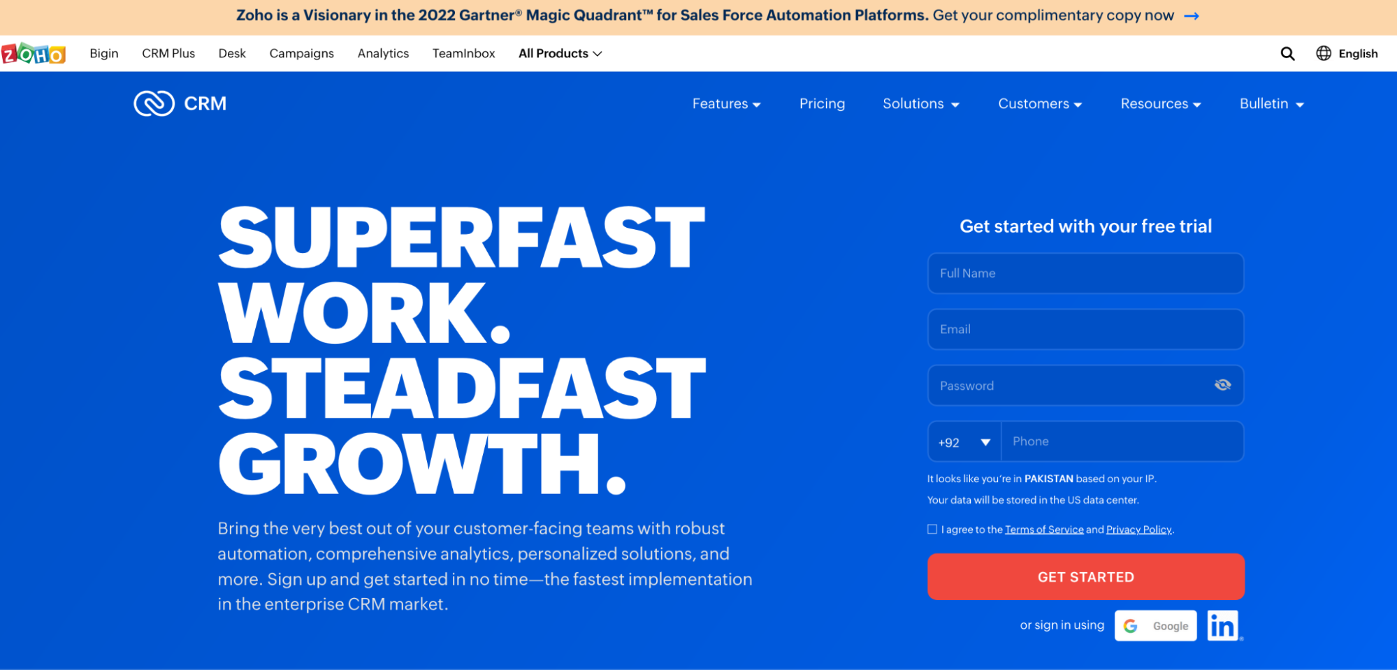
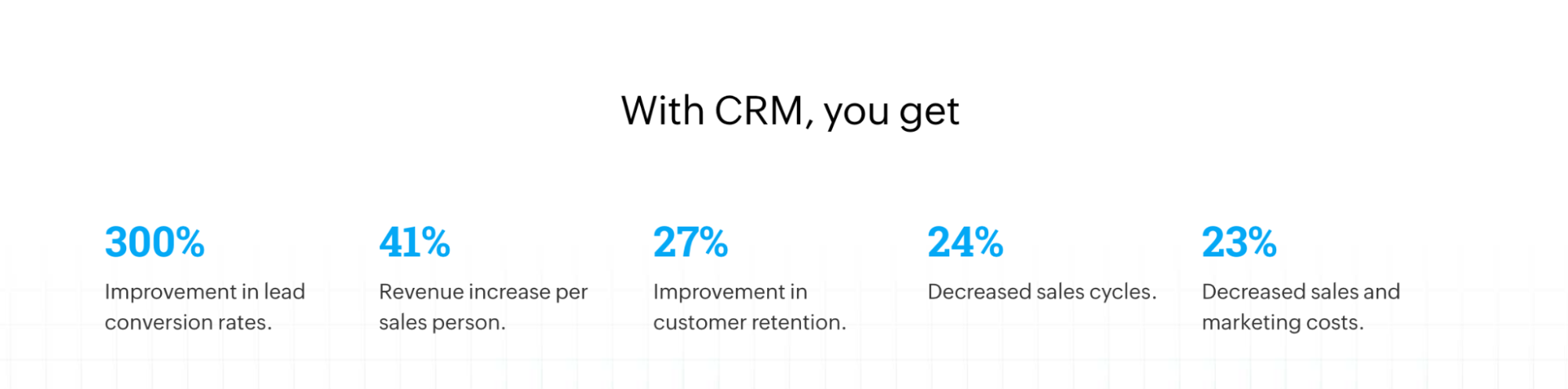
 Homepages are focused on drawing visitors into the marketing funnel. Your campaign landing pages also do the same—convert visitors for specific offers to move them through the marketing funnel. So, how are the two pages different? So, what is a landing page, and what factors distinguish it from your homepage? Website homepage vs. landing page: What you need to know What’s the goal of the pageOn your homepage, that goal is impossible to predict for every visitor. New prospects or returning leads might want to know the story behind your business, while others will head straight for plans and pricing information. That’s why homepages include navigation bars and multiple outbound links that offer visitors easy access to any content they might want. Landing page vs. homepage examplesLet’s take the Zoho CRM product homepage, for example, on which navigation allows customers, developers, and prospects to learn every little detail about the tool:
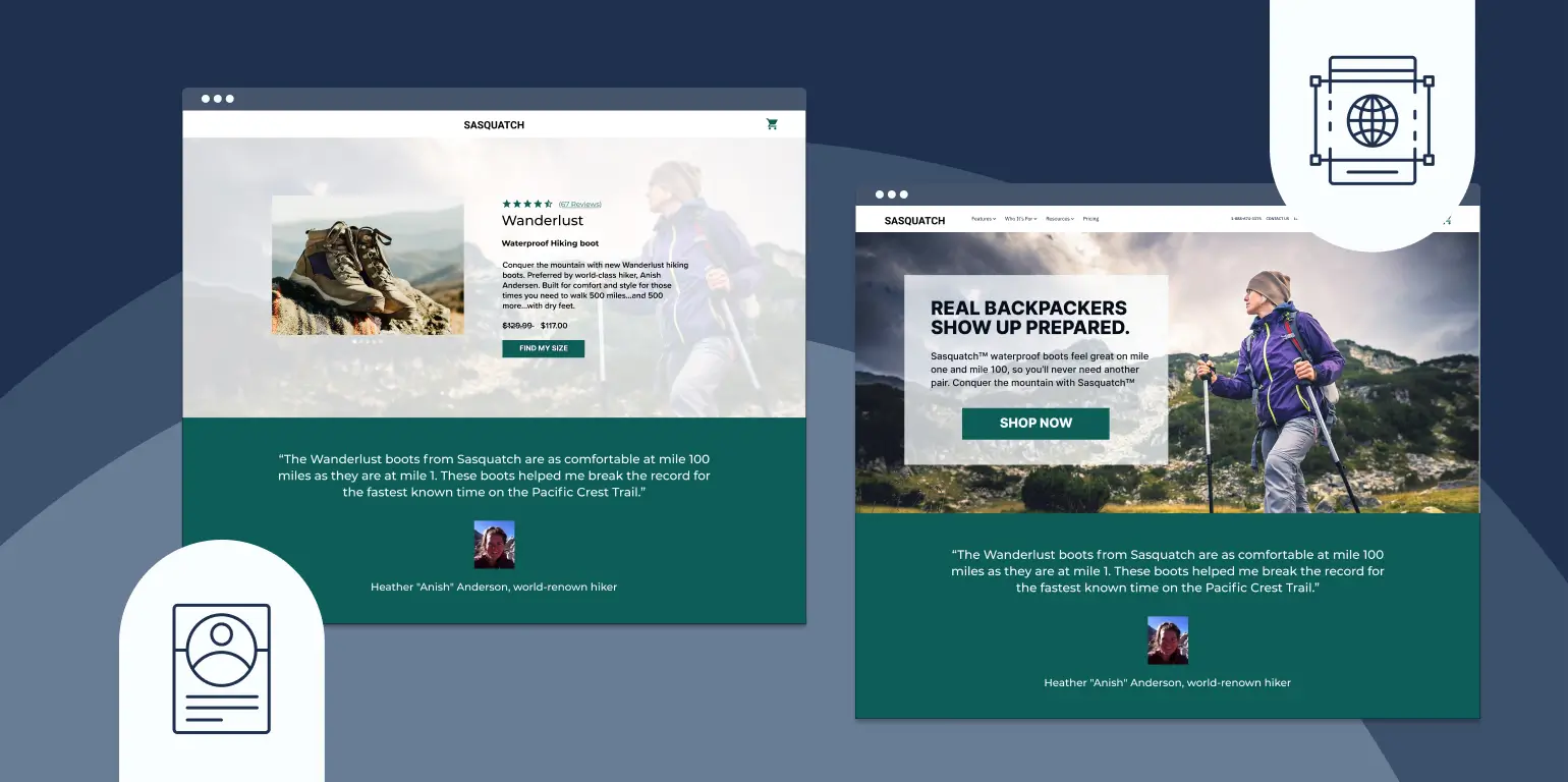
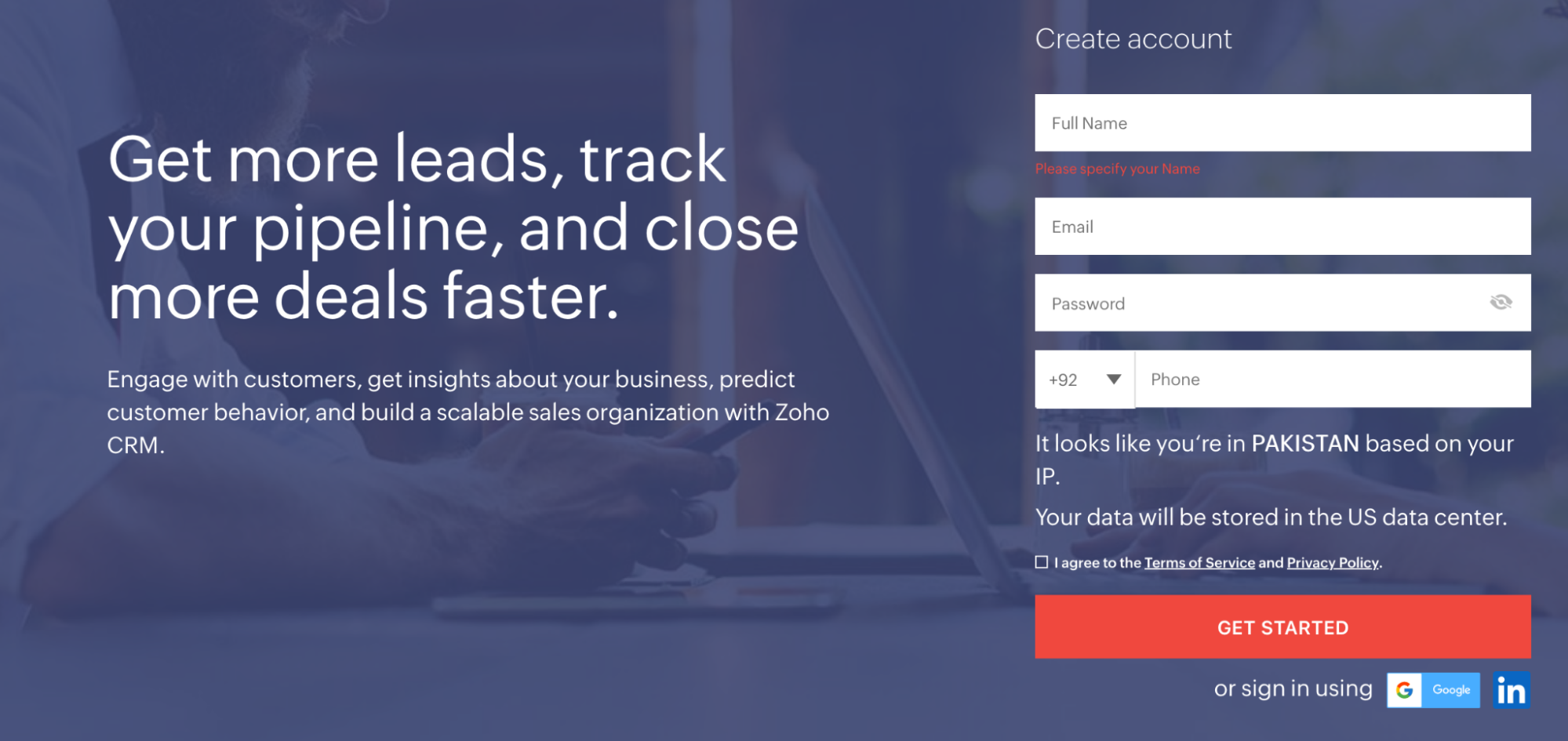
Landing pages, though, have only one goal: to convert a visitor on an offer. When users navigate to your landing page from a promotional link, it’s because they’re considering claiming the offer you advertised. That’s why, on your landing page, it’s your job to include only the information your visitor will need to determine whether that offer is worth claiming. Here’s a landing page built by the same company:
Major design differences can be seen above the fold, even at a glance. The lack of navigation on this page keeps visitors focused on the offer they clicked through to evaluate. The headline on the landing page is far more benefit-oriented than the one on the homepage. Below the fold, the homepage features screenshots from the app:
While the landing page features specific numbers to prove the effectiveness of the tool.
Landing page:Scroll even lower and you’ll see the Zoho homepage uses small paragraphs of text that drive visitors to feature pages of the website. Homepage:
While the landing page substitutes that for social proof:
On the homepage, there were more than 80 links to other pages that weren’t CTAs. On the landing page, there were two. Still, two is too many. The ratio of links to CTA buttons (aka your “conversion ratio”) on your landing page should always be 1:1. Here’s another example from FreshBooks. First, their homepage, above the fold:
Now, one of the company’s landing pages, above the fold:
The landing page is focused on the “Try it Free” offer—the navigation menu has been removed to keep visitors focused on evaluating the offer. While the homepage and landing page both feature social proof and benefits of the accounting software—the landing page is focused on just getting visitors to sign up, the homepage also features the pricing plans, FAQs, and additional product details, and of course, lots of exit links. Don’t let the paradox of choice kick inRemember the paradox of choice: The more options you have, the harder it becomes to make a decision. That’s why it always takes longer to order in restaurants with more extensive menus. In the restaurant that is your landing page, CTAs are your menu items. Only offer your visitors one to choose from. FreshBooks does that with the “Try It Free” call-to-action throughout the page. On their homepage, FreshBooks offers visitors multiple CTAs, which is okay. These “secondary CTAs” like “Learn more” help prospects find the answers to their questions, and if they’re designed right, they won’t even divert too much attention from the primary CTA. Can you spot the primary call-to-action and the secondary call-to-action on this page?
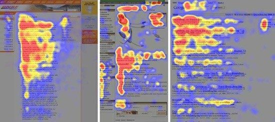
See how “Try It Free” pops more than the colorless “Learn More” buttons below? This is to draw the visitor to the “Try It Free” button, but they’re still giving prospects the opportunity to learn if they’re not ready to try. And that’s the most significant difference between a website homepage and a landing page. The homepage focuses more on informing and empowering the visitor, while the landing page focuses on persuading the visitor. The goal of every homepage visitor we can’t know for sure. The goal of the landing page visitor, though? It’s to make a decision. Build an anatomically correct landing page to help them do it. Both landing pages and website homepages must guide visitors with a visual hierarchyEven since before the internet, people have been viewing pages the same way. Early eye-tracking studies showed that readers first enter a page through an image or headline on a written page, then glance down the left side to look for bulleted or italicized text. Body copy was read last. On the web, this has become known as the F-shape pattern:
To get readers to view your most important content, you’ll need to create what’s called a “visual hierarchy” based on the way people like to read. It should look something like this:
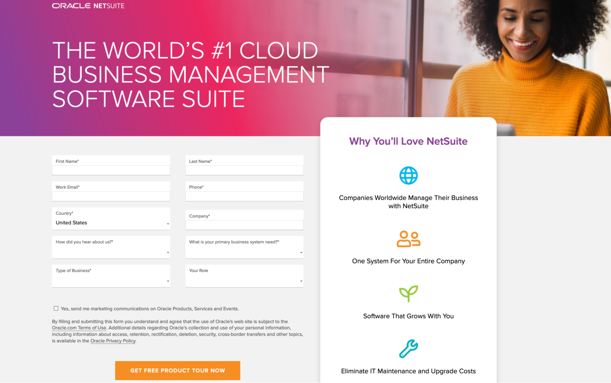
The hierarchy should also be based on familiar web design principles. For example, logos are always in the upper left of a web page. Links are either underlined or a different color from the rest of the text. Don’t try to reinvent the way people read on the web. An MIT study once showed that people prefer page layouts that are familiar to ones that attempt to stray from longstanding best practices. ExampleHere’s an example of a good visual hierarchy from Oracle:
The image and headline catch the reader’s eye. Below that, bullet points convey important information about the software. To the right, a form collects prospect information, and a brightly colored button completes the conversion. Here’s a homepage that creates a good visual hierarchy (click here to see the full homepage):
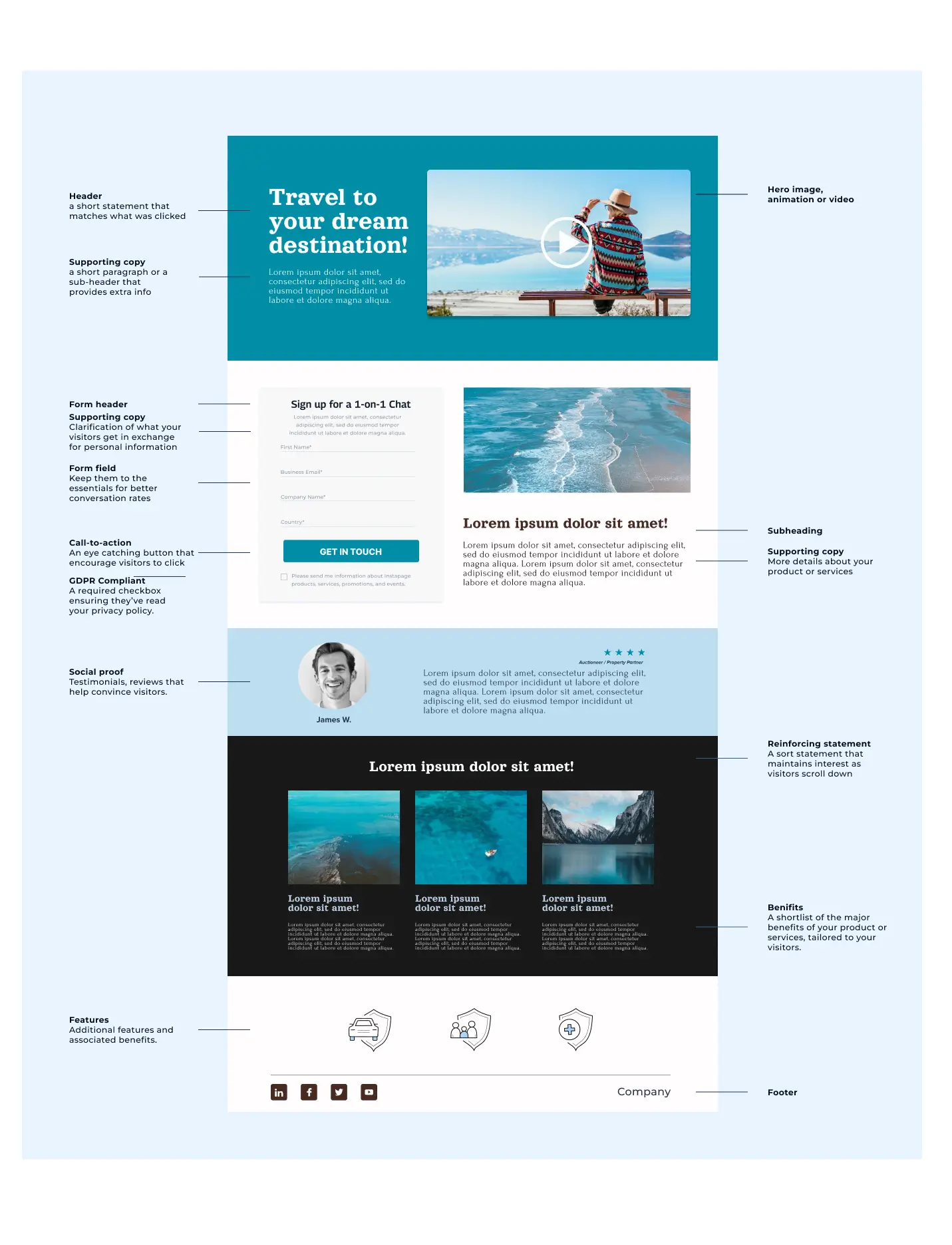
Website homepages and landing pages have more in common than you thinkAll this talk about website homepages vs. landing pages might have you thinking they’re two completely different webpages. In some ways, they certainly are. But at the core, they’re the same. When creating landing pages, Instapage is the optimal choice. Instapage makes it easy to create personalized, relevant landing pages for every ad group and audience. Sign up for a 14-day trial and start increasing your conversion rates today. from The Marketing Method Blog - Instapage https://ift.tt/ESNf9UF Ads Spy Tool - Spy Your Competitors' Ads, Keywords & Creatives https://ift.tt/60lhfRw Online Money Making Method - https://ift.tt/1g0l8Ft  Whether it’s encouraging visitors to make a purchase, subscribe to your newsletter, or download valuable resources, understanding the anatomy of a landing page is key to converting visitors into customers. Today, we’re going to break down the components that make up a successful landing page. By understanding the fundamental elements and how they work together, you’ll gain the knowledge and skills needed to create optimized landing pages that deliver higher conversion rates and a strong return on ad spend.. In this post, we’ll explore each element in detail, revealing their purpose and importance. By the end, you’ll have the insights and tools necessary to design an effective landing page that drives conversions. Let’s begin with what is a landing page. What is a landing page?At its simplest, a landing page is a standalone web page, disconnected from a website’s navigation, created to convince a visitor to act (to sign up, buy, download, etc.).
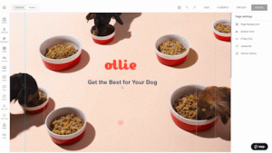
The following elements make up your landing page. 1. The Headline and Sub-headlineThe headline is one of the most important part of your page. Without a compelling one, most people won’t even bother to read the rest of your landing page. The secret to writing a good headline is to make sure it conveys your unique value proposition (UVP)—the thing that sets your product or service apart from the others in your industry. Can your launch sequences help customers generate leads faster than their current solution? Will you help them generate higher-quality leads? Does your product have more features than what’s currently on the market? Communicate that in your headline or sub-headline. Another thing you need to establish with your headline is message match. This refers to the process of matching the content of an ad to the content of a landing page so that the message is reinforced in the mind of the prospect, and that they know it’s relevant. For example, if you’re running an ad for social media management software, make sure “social media management” is mentioned somewhere in the headline of your landing page. Otherwise, you risk leaving your visitors confused, wondering how they ended up on a page that has nothing to do with the ad they clicked. Here’s how to create a great benefit-oriented headline that matches well with its corresponding social media post, courtesy of Hootsuite:
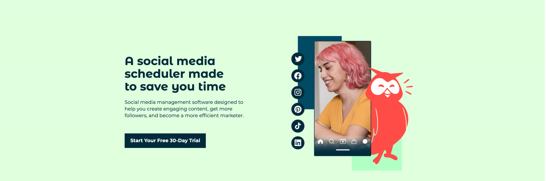
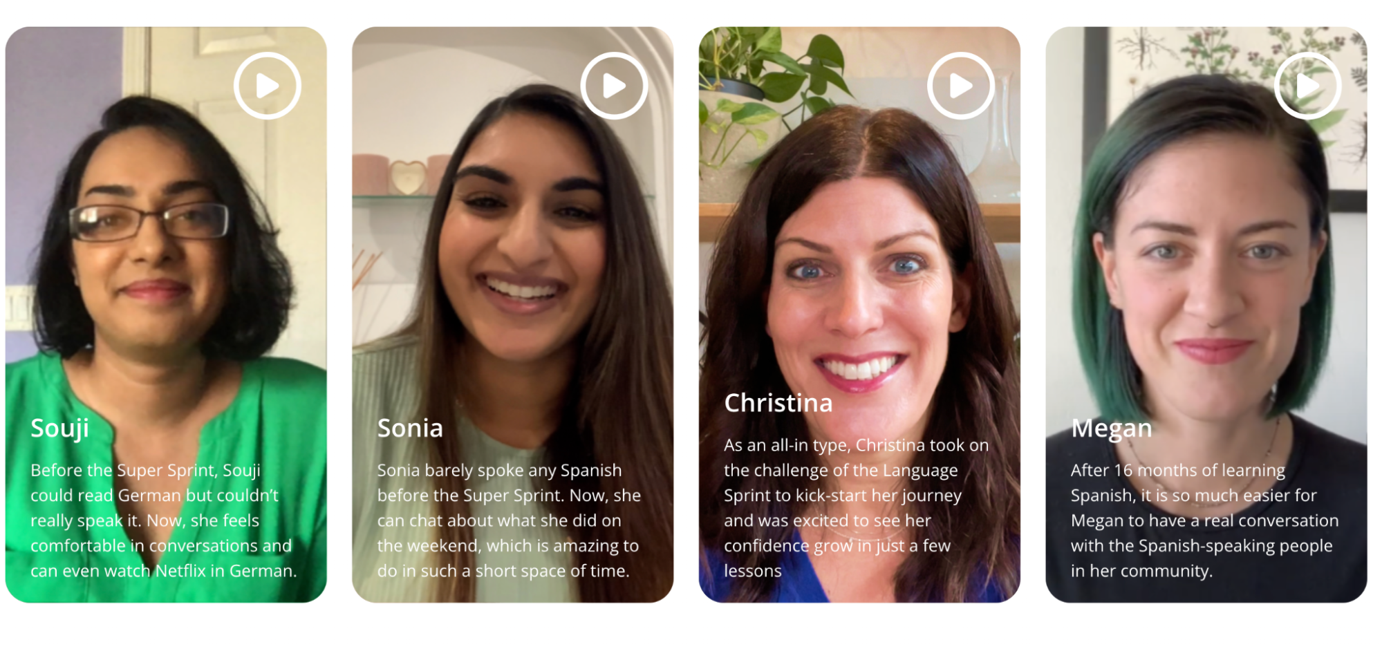
2. Engaging MediaHumans are capable of processing visuals up to 60,000 times faster than text. Which means your visitors would much rather you show them how your product works than tell them in writing. To make the right impact with media, use of a relevant “hero image” to give them a glimpse of how your product or service would change their lives for the better instead of adding irrelevant stock photos as placeholders, You can also add explainer videos explaining how your product works, with a focus on user benefits. You can also include real, satisfied customer reviews in your video or photo. That way, along with explaining your product or service, you’ll also get the perks of the social proof effect. This is what Podium does on their landing page along with adding more CTAs.
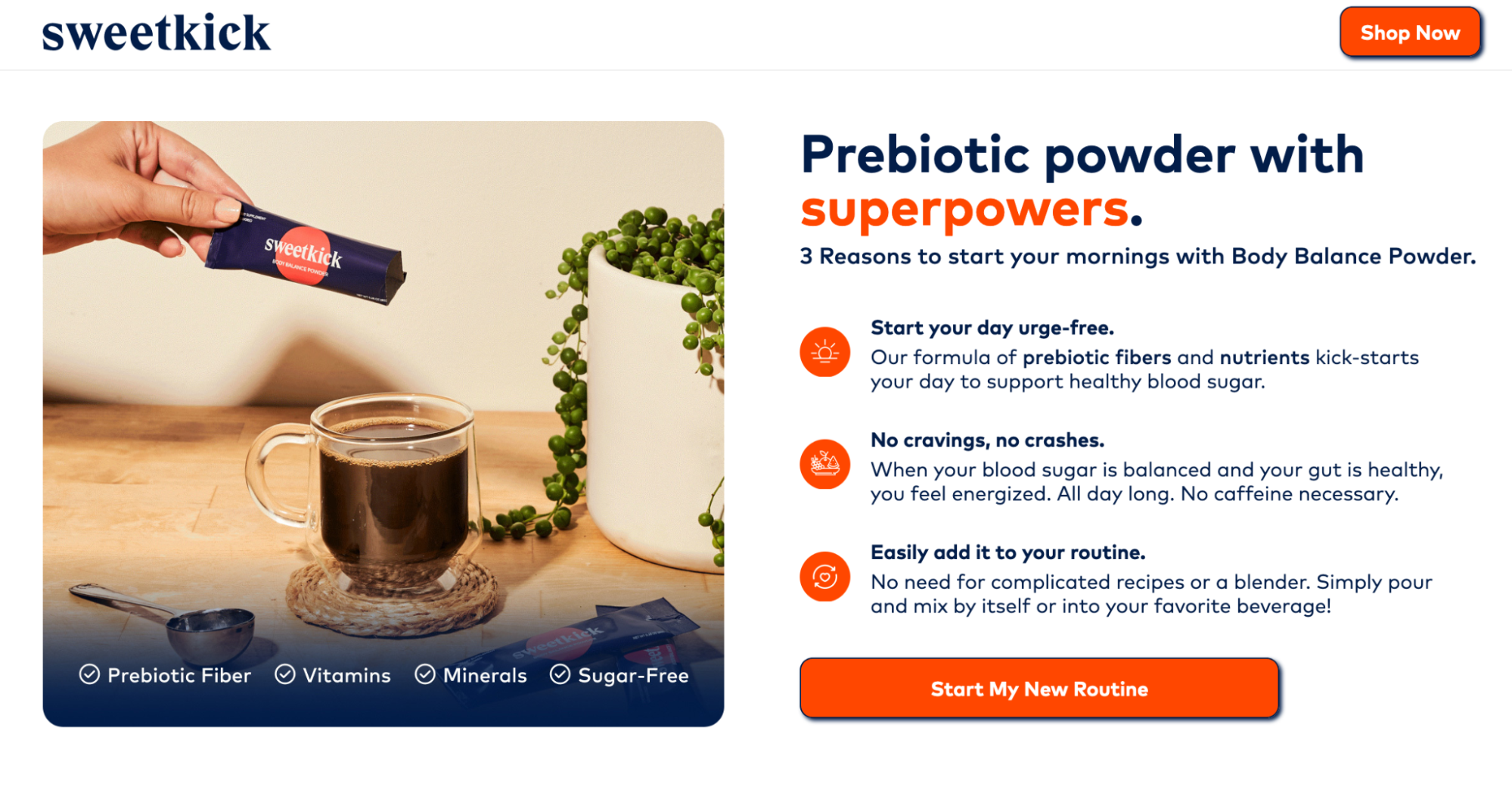
3. Concise, benefit-centered copyOn your landing page, you’ll be tempted to tell your prospects about the high-powered, new, and improved feature that makes your product so great. And while highlighting product features is a good approach, it’s important to highlight user benefits even more emphatically. By highlighting user benefits, you shift the focus from the product itself to what it can do for the customer. This customer-centric approach resonates better with visitors and addresses their needs, desires, and pain points directly. Make sure that when you’re making the case for why your prospects should convert, you do so by concisely conveying benefits over features. Our attention spans have shrunk to less than 8 seconds, so when we read online, we skim. Employ the use of numbered lists and bullet points to separate your copy into easily digestible chunks. Don’t make your prospect read more than two to three consecutive sentences of block text. The Sweetkick landing page highlights user benefits in a concise and easily readable way.
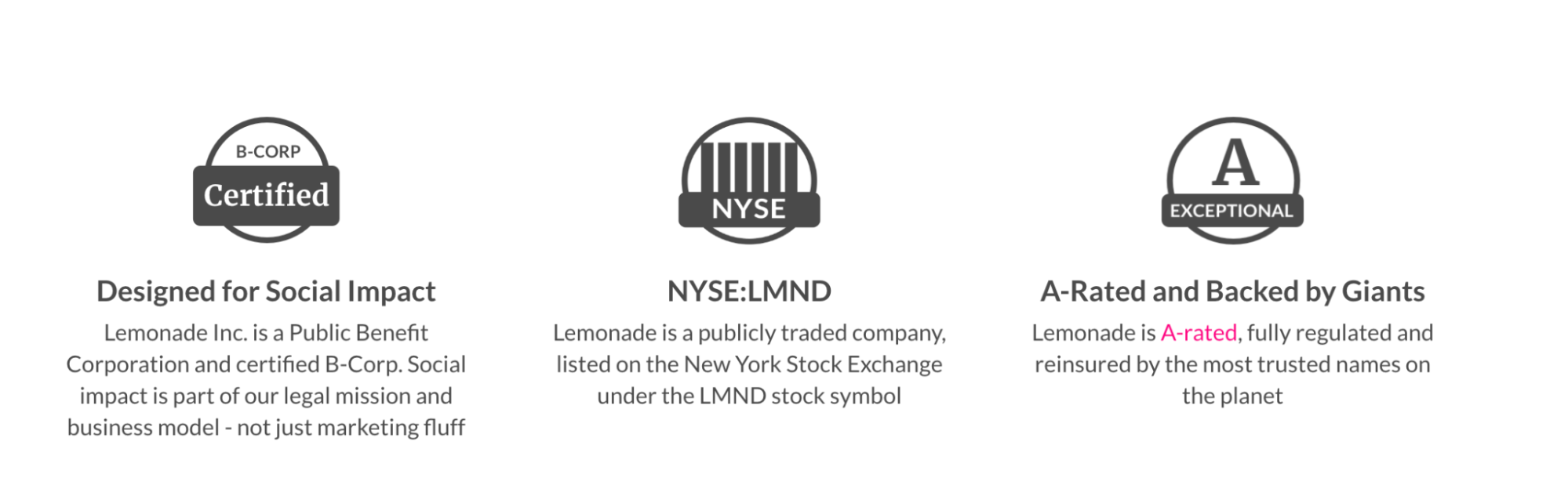
5. Social proofIf you’re like most people, before you purchase a new product or subscribe to a service, you’ll ask around your social circle for recommendations from people you trust. This holds true even online. Research has shown that 92% of people value recommendations from a peer, and 70% of people will trust a recommendation from someone they don’t even know. So what does that mean for your landing page? It means you should leverage one of the most powerful ways to boost the odds that people click your CTA button: adding social proof. Authority badges like awards from other websites, and logos of well-known companies you’ve worked with empower visitors to trust you. Here’s a great example from Lemonade of how to use authority badges to your advantage:
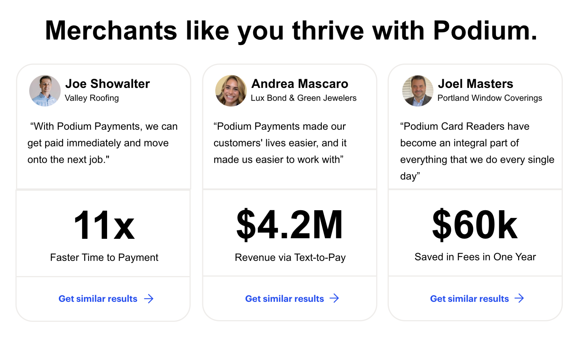
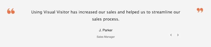
Lastly, and possibly the most powerful of all social proof, is the testimonial. When used right, there’s nothing more powerful than a recommendation from a satisfied customer. Get quotes from them — and don’t settle for something generic like “They boosted our ROI.” Get specific. Get numbers. Get names, titles, and photos of the people who are speaking on behalf of your business. The more you can display about them, the more real they become to your visitors. For example, what’s more, convincing to you — this testimonial:
Or this one?
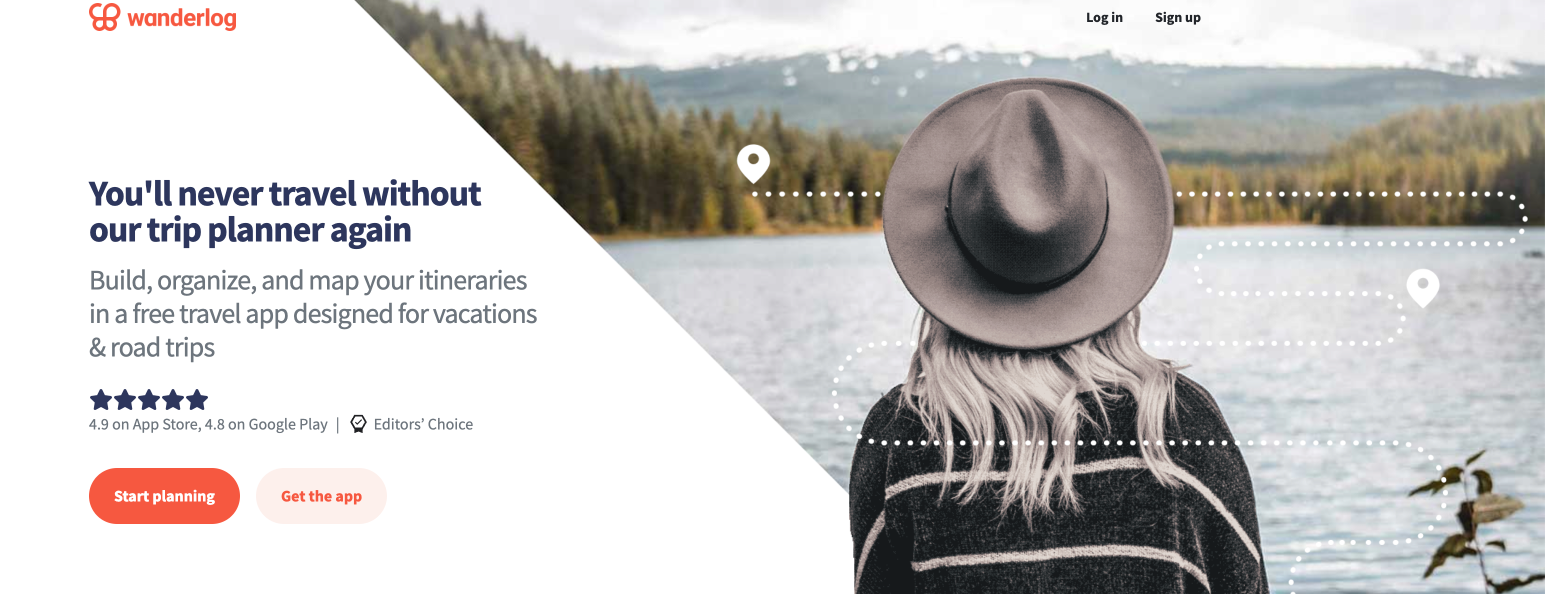
6. A strong call-to-actionThis is the moment you’ve been waiting for. The searching for powerful synonyms to create compelling copy, all the headline testing, and customer interviews have been done for one reason: to get your visitors to click that call-to-action button. This is the one element that jumps out at your visitors. When they reach your landing page, they should notice your CTA button immediately. That doesn’t mean you should use red or orange or bright yellow because those are the colors you think are attention-grabbing. It means you should use color theory to find a hue, tone, tint, or shade that stands out from the rest of your page. As far as copy goes, don’t settle for something boring and overused. Use your UVP to help you come up with something more compelling. For example, if your email newsletter promises to make its subscribers better writers, then don’t just use “Subscribe” or “Sign up” as your button copy. Use something like “Show me step by step,” or “Teach me the secrets to better writing.” Here’s a call-to action from Wanderlog that plays off its landing page headline well:
7. Minimalist footerIf your landing page has a footer, it shouldn’t be like the one on the rest of your website. It shouldn’t have a sitemap, related blog posts, or any links to your social media accounts. Why? Because with each link you add, you drill another hole in your landing page. If you do choose to have a footer, use it to display nothing more than up-to-date copyright information, terms of service, and your privacy policy — like our landing page for 10 Landing page Best Practices for 2023 does:
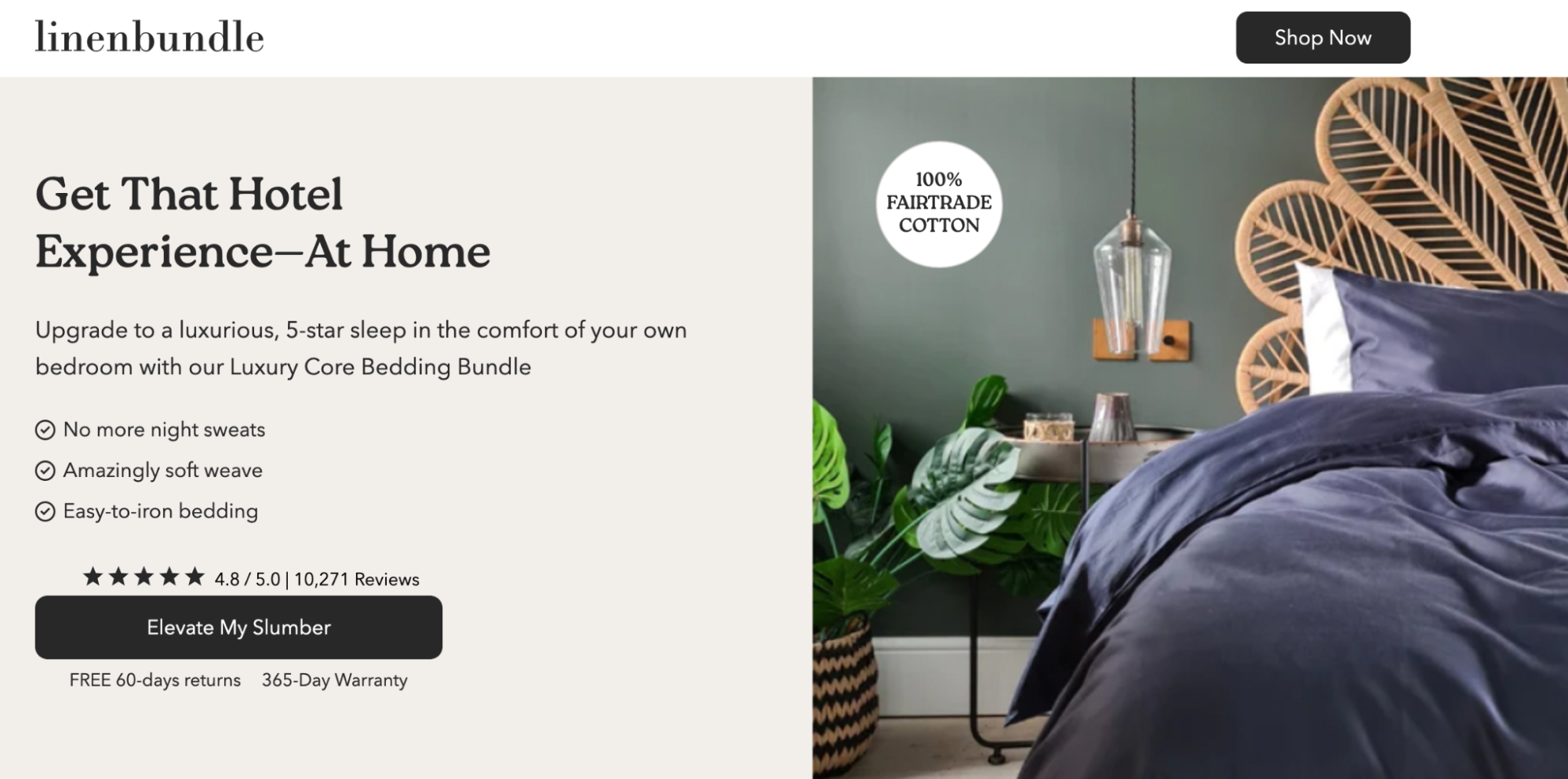
7. No Exit LinksWhile other pages on your website are created for a browsing experience, landing pages are made to achieve a single goal: to convert visitors into customers. Think of the page as a virtual elevator pitch, delivering all the essential information your prospects need to know about your offer in a concise and compelling way. So, navigation links, like a header and footer have no place on your page—anything that could distract visitors from the conversion goal. For example, the Linenbundle page focuses on getting the visitor to shop the sheets and elevate their slumber. There are no navigation links on the page, and both CTAs point take visitors to the same conversion goal.
8. Contact informationSometimes, especially if your offer is pricey or complicated, your landing page visitors are going to want to talk to a representative from your company. Give them more than just a contact form to fill out. Add a phone number to your page where they can reach you if they have any questions. Here’s an example from Travelers, which gives visitors the option to either get their quote digitally or call a number. ConclusionRemember: this is just the basic anatomy of a high-converting landing page. Different combinations of the elements above will produce different results for individual businesses. You’ll need to continually test and optimize to perfect yours. Sign up for an Instapage 14-day free trial today and start building landing pages using our 500+ customizable layouts and see what works for your audience. from The Marketing Method Blog - Instapage https://ift.tt/NguyqQ0 Ads Spy Tool - Spy Your Competitors' Ads, Keywords & Creatives https://ift.tt/YTyi3LS Online Money Making Method - https://ift.tt/zRN2aDQ  Creating a frictionless conversion experience on your landing page is the key to increasing ROAS (return on ad spend) for your automotive marketing campaigns. As automotive marketers, you want to seamlessly guide potential customers through the sales funnel, from the moment they land on your ad to the final conversion. But what tactics can you deploy to achieve better results? To help you optimize your landing pages and achieve higher ROAS, we have distilled some critical takeaways from Driveway’s successful approach. By incorporating these tactics into your automotive-focused campaigns, you can increase conversions and create a more impactful user experience. Three of our favorite elements of the Driveway Landing Page (and why you should add these elements to your landing pages!)Answer Visitors’ Most Important Questions Leverage Authority Logos Include a Sticky CTA Button What we would experiment with:At Instapage, we believe that constant testing & experimentation is necessary to achieve the best landing page conversion rates. With that in mind, here are some elements we would test on the Driveway landing page:
By incorporating the key takeaways we have distilled from Driveway’s landing page strategy, you can optimize your automotive landing pages and achieve better results! If you’d like to explore ways you can easily implement these tactics on your landing pages, sign up for an Instapage 14-day trial and see the impact a powerful landing page platform can have on your campaigns. You can also watch the full Driveway landing page review here. from The Marketing Method Blog - Instapage https://ift.tt/g03BfNm Ads Spy Tool - Spy Your Competitors' Ads, Keywords & Creatives https://ift.tt/Kjxh9a4 Online Money Making Method - https://ift.tt/HarqjWT 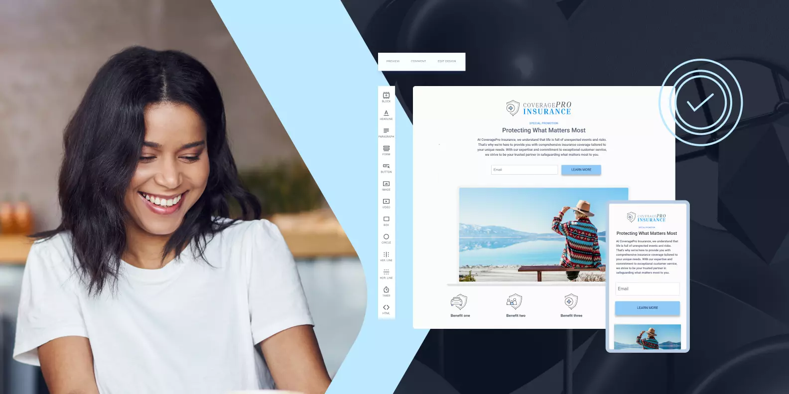 Insurance is a unique product that people hope they’ll never have to use. It’s not something they eagerly seek out. Unfortunately, life doesn’t always go as planned, and that’s where insurance marketers like you step in. Insurance marketers play a vital role in making people contemplate the “what if” scenarios. The right insurance landing page can not only make them confident in their choice but offer them peace of mind. However, the journey from prospect to policyholder is no easy task. It typically involves a lengthy process of exams, estimates, and appraisals. So, in this digital age, how can you inspire prospects to take that crucial first step and request a quote from your agency? That’s where the power of insurance landing pages comes in. In this blog, we’ll explore the best practices and tactics for creating exceptional insurance landing pages that engage, inform, and entice. Let’s dive in and discover how you can leverage the full potential of digital marketing to revolutionize your insurance campaigns. Get ready to captivate your audience and inspire them to embrace the protection and peace of mind that insurance provides. Include Clear Coverage DetailsWhen it comes to insurance, clarity is key. To ensure potential customers have a thorough understanding of the coverage options available, it’s vital to provide them with clear and comprehensive information. Break down the policy details in a way that is easily digestible and avoids overwhelming jargon. Clearly explain concepts such as deductibles, limits, and any additional features or riders associated with the insurance product. By presenting the coverage details in a transparent and user-friendly manner, you establish trust and enable customers to make well-informed decisions about their insurance needs. Seamlessly Integrate with Quote or Application ProcessesMinimize friction in the customer journey by seamlessly integrating your landing page with the quote or application process. Enable visitors to smoothly transition from learning about your insurance product to obtaining a quote or completing an application, all within the same user experience. Streamline the process by minimizing the number of steps and eliminating unnecessary barriers. A user-friendly and efficient quote or application process enhances the overall customer experience, improves conversion rates, and instills confidence in potential customers as they progress toward securing coverage. Add a Comparative AnalysisIn a competitive insurance landscape, a comparative analysis feature can be a powerful differentiator. Provide visitors with the ability to compare your insurance product directly with offerings from competitors on the landing page (bonus points if it’s above the fold). Highlight the unique selling points and advantages of your insurance solution, showcasing why it stands out from the rest. Emphasize key differentiating factors, such as superior coverage, better customer service, or more competitive pricing. By presenting a clear and compelling case for your insurance product’s superiority, you capture the attention of potential customers and sway them toward converting to your landing page. Place Trust Signals Throughout the PageTrust is the foundation of the insurance industry. To inspire confidence in potential customers, you should leverage trust signals such as display logos or badges of industry associations you belong to, affiliations with well-known insurance providers or reinsurers, or certifications that highlight your commitment to industry standards. These trust signals communicate credibility, reliability, and adherence to stringent quality benchmarks. By prominently showcasing such trust signals, you reinforce your brand’s reputation and reassure potential customers that they can place their trust in your offerings. Include Education ResourcesEmpowering potential customers with knowledge is an important tool in the insurance industry. Offer links below the fold to educational content and resources that go beyond simply promoting your insurance offerings. Consider selectively sharing links to or snippets of informative articles, blog posts, FAQs, or guides that explain fundamental insurance concepts, demystify industry terminology, and provide insights into best practices for selecting the right coverage. By becoming a valuable resource and trusted advisor, you’ll position your brand as an authority in the field–fostering strong connections with your audience and increasing the likelihood of conversion. ConclusionAs insurance marketers, you hold the power to inspire confidence and peace of mind in potential customers, guiding them toward the protection they seek. By implementing the tactics and best practices we’ve explored in this blog, you can transform your insurance landing pages into captivating and effective tools that drive conversions. By continuously optimizing and refining your landing pages, you’ll be at the forefront of the industry, driving success and creating meaningful connections with your customers. So, go forth, implement these best practices, and elevate your insurance marketing efforts to new heights! Are you ready to elevate your insurance marketing game with high-converting landing pages? Sign up today for a 14-day trial and see the impact Instapage has on your campaign results! from The Marketing Method Blog - Instapage https://ift.tt/AWI2EGe Ads Spy Tool - Spy Your Competitors' Ads, Keywords & Creatives https://ift.tt/YNtE2hr Online Money Making Method - https://ift.tt/MtIB7ql 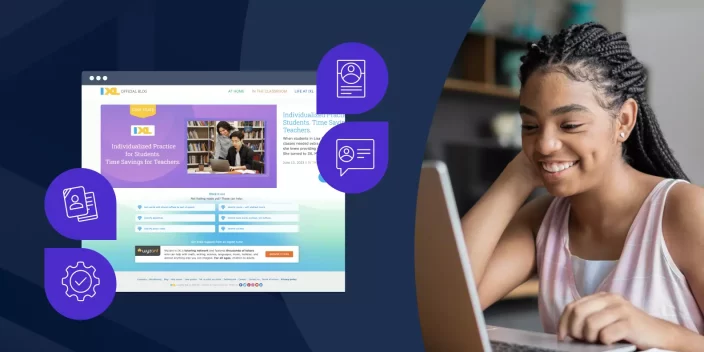 As technology continues to transform the education landscape, it becomes increasingly vital for companies in the edtech industry to create landing pages that resonate with their target audience. As a hub for personalized learning resources, IXL’s landing page serves as an excellent example of how personalization can significantly impact student conversions and engagement. To help you optimize your landing pages and achieve better results, we have distilled some key takeaways from IXL’s successful approach. By incorporating these strategies into your edtech landing pages, you can effectively increase conversions and create a more impactful user experience. Three of our favorite elements of the IXL Landing Page (and why you should add these elements to your landing page!)Maximize the Above the-Fold Section: The top section of your landing page (visible content without the need to scroll down), plays a vital role in capturing users’ attention and engaging them right from the start. This can be achieved by presenting information clearly and concisely and avoiding overwhelming or confusing text. Be sure to place important elements such as call-to-action (CTA) buttons, social proof, and customized geographic examples above the fold, so that visitors can easily comprehend the purpose and value of your offering without having to navigate further. This approach enhances the user experience, increases the likelihood of conversions, and maximizes the impact of your landing page. Add Personalization Elements: On IXL’s landing page, they go beyond generic messaging and incorporate a personalized element in the above-the-fold section. Specifically, they include the line “IXL helps DC schools excel,” which is tailored to a target geographic location. This personalized touch instantly resonates with individuals in that area by addressing their unique needs and context, creating a sense of familiarity and relevance. Simplify Detailed Information: IXL’s landing page, below the fold incorporates a fantastic infographic that effectively highlights what IXL offers to school administrators and provides a concise overview of their solution. By using visual elements, such as icons, charts, and graphs, the information is presented in a visually appealing and easily understandable format. This enables visitors to quickly grasp the key benefits without the need to read through long text blocks. Additionally, condensing content reduces scroll depth, making the page more accessible on mobile devices. What we would experiment with:
By incorporating the key takeaways we have distilled from IXL’s successful landing page strategy, you can optimize your edtech landing pages and achieve better results. Remember, personalization is not just a buzzword—it is a powerful tool that can significantly impact conversions and engagement. As you embark on refining your landing pages, take the time to understand your audience’s unique needs, challenges, and aspirations. Focus on your above-the-fold section, incorporate personalization elements wherever possible, and, work on simplifying complex information. By doing so, you will position your offerings as indispensable solutions in the ever-evolving education landscape. If you’d like to see the impact these tactics could have on your campaigns, sign up today for an Instapage 14-day trial and see the impact a powerful landing page platform can have on your campaigns. You can also watch the full IXL landing page review here. from The Marketing Method Blog - Instapage https://ift.tt/DtsRjvP Ads Spy Tool - Spy Your Competitors' Ads, Keywords & Creatives https://ift.tt/NxTIFcb Online Money Making Method - https://ift.tt/EJ7D4zm  When it comes to landing page performance there’s no one-size-fits-all answer. Ultimately, the only way marketers know what works and what doesn’t is to test it. But what elements can you change and test for the biggest impact? In this blog, we’ll walk through 15 expert-approved tips for improving your landing page performance (with examples!). Tip #1: Design for mobile-firstDid you know that the majority of today’s web traffic is from mobile devices? Because of this, it’s absolutely critical that you prioritize your landing page mobile experience. Use responsive design, try to keep the page concise, and prompt your mobile visitors to take action (with the least amount of friction possible). See how Instacart leverages a mobile-first landing page approach: Tip #2: Create message-match consistencyMatching your messaging between your ads and landing pages is one of the best ways to gain trust with your audience. Make sure you maintain consistency in message, tone, visuals, and overall branding. See how HubSpot achieves this: Tip #3: Remove navigation bars and footersCompelling landing pages keep the visitor focused on conversion with a singular call-to-action (CTA). By removing distractions and exit opportunities, you’ll force your visitors to focus on the conversion offer presented to them. Here’s an example from website builder Wix: Tip #4: Use visual hierarchyVisual hierarchy refers to the order in which people notice visual elements on a page. By leveraging this principle on your landing pages, you can be intentional with the information you display, and how your visitors will process it. Pro tip: Viewers naturally assume elements are important when they:
Kitchenware company Sur La Table does a great job of using placement, size, and color contrast to juggle multiple offers: Tip #5: Optimize for skimmingHere’s a fact that no proud marketer wants to admit: it’s highly unlikely that your audience will read all of your copy and content. People will naturally skim the page, so you should design your landing page through that lens. Visitors will enter the page through the largest element–usually an image or headline–then unconsciously use F and Z patterns to skim down the page for subheaders, bullets, and bolded content. So use that to your marketing advantage! Online learning site Udemy does this well by enhancing skimming optimization with bold headlines and bullet points–calling out valuable information: Tip #6: Ask a questionThe best way to engage your visitor? Ask a question! Questions can be effective because they naturally prompt a response in the form of reflection, which is more effective than commanding your visitors to buy, read, download, etc. For example, instead of saying “Get the guide to doubling your app downloads,” try asking “Would you like to double your app downloads?” Naturally, the answer will be yes. AdEspresso uses this tactic to promote their training sessions: Tip #7: Showcase benefits with a hero shotCopywriting 101: stress benefits over features. Your customers don’t care about a feature unless they understand how it will help them. Big, bold hero images are often the visual equivalent of leading with a feature-first mentality. Here’s an example from wearable weight brand Bala Bangles: Tip #8: Incorporate videoIn an online world where we’re all competing for attention, video can be your secret weapon. Showing what your product or service can do (rather than telling) can take you a long way, making your offer easy to digest. Paddleboard company BOTE Board offers an adorable explanatory video showing how their product works: Tip #9: Try an AI content generatorWith the help of AI, writer’s block is becoming a thing of the past. New technology allows you to generate content such as headlines, product descriptions, ads, CTAs, etc. Don’t be scared to use AI to your advantage when brainstorming new copy to test on your landing pages. The Instapage platform includes a built-in AI Content Generator: Tip #10: Use scarcity and urgencyScarcity can be a powerful tool for influencing and driving conversions. People are naturally drawn to exclusivity, so if they believe your product or service is in limited supply, they’ll want to grab it before it’s gone. For example, if your product is rare or in high-demand, like a virtual course running out of space, try a phrase like “limited seats available” to instill a sense of urgency and entice potential customers to sign-up before they miss out. Note: scarcity isn’t always appropriate. If you’ve already used this tactic and it’s not paying off, it’s possible you’ve tried it too many times and in the wrong context. The secret to scarcity is that it must be true. If you implement this strategy for every product or service, you’ll quickly lose credibility with your visitors. Urgency works much like scarcity–but relating to time. SwissWatchExpo uses urgency to advertise their time-sensitive discount: Tip #11: Use contrasting colorsContrasting colors enhance readability. If your landing page is white and your font is light gray, it will be hard to read. For the best readability on screens, use a light-colored background on and a dark font. Planoly creates a high level of contrast by consistently using black text on a light background and on their bright CTA buttons: Tip #12: Check your copy lengthCan you eliminate a paragraph? Are there filler words you can cut out? Your copy should be as short as possible–while still conveying all the necessary information. Of course, there are exceptions to every rule. Some pages require longer copy, and that’s okay! If you’ve tried short content and you’re not seeing results, ask yourself what information may be missing. Impossible Foods has been around for over a decade, but many potential customers have never tried a plant-based meat substitute. See how they use longer copy with captivating imagery to give an overview of their benefits: Tip #13: Prepopulate forms whenever you canTo remove friction prepopulate your forms wherever possible. If a returning visitor has already claimed an asset or made a purchase from you, it’s likely you have data such as their name, email, etc. Don’t make them enter it again. If you have these details, prefill them during future visits on your site. Tip #14: Make your CTA button obviousCreativity is a powerful tool for marketers. However, going overboard with your CTA button variations such as irregular shapes or low contrast can confuse visitors and cause them to miss your button. Don’t make that mistake! Always aim for clarity with buttons and make sure they stand out on the page. Tip #15: Include testimonialsTestimonials will add credibility to any offer. They’re powerful because they’re not ad copy–instead, they’re a form of social proof provided by a satisfied customer. Pro tip: ensure your testimonials offer as much detail about the customer as possible to validate the fact that the positive review came from a real person–not from your marketing department. Naturally, we have to share one of the ways we leverage Instapage testimonials in on our pages: There you have it–15 tips to boost your landing page performance. But you didn’t think that was all, did you? We’ve compiled a more detailed list for you in our ebook, 46 tips for High-Performing Landing Pages. Remember–the key is to continuously test and iterate to find what works best for your business and goals. Now, go forth and create landing pages that make a lasting impact! Better landing pages = higher ROAS Looking for an easier way to build high-performing landing pages at scale, and get more from your advertising spend? Instapage can help. Check out our Build and Convert plans here. from The Marketing Method Blog - Instapage https://ift.tt/EWc8Ty6 Ads Spy Tool - Spy Your Competitors' Ads, Keywords & Creatives https://ift.tt/NxTIFcb Online Money Making Method - https://ift.tt/EJ7D4zm  Landing pages play a critical role in converting your visitors into customers. A well-crafted page can make all the difference in capturing attention, driving engagement, and ultimately securing new business. In this blog we will explore ten essential best practices for creating landing pages that resonate with your audience and drive results. Let’s dive in! Tip #1: Focus on your audienceTo create an effective landing page, it’s critical that you understand your target audience. You’ll want to research their needs, preferences, and pain points to ensure your messaging speaks directly to them–addressing their current needs, wants or challenges–and offering up solutions. Tip #2: Build a narrative from your ad to landing pageEnsure a seamless transition for your visitors by aligning the messaging in your ad to its respective landing page. By maintaining consistency in tone, visuals, and overall branding, you’ll create a cohesive narrative–building trust and keeping visitors engaged. This, in turn, will increase the likelihood of driving conversions. Tip #3: Tie your features and benefits to pain pointsMake sure to highlight the features of your product or service; demonstrate how they directly address your audience’s pain points. It’s essential to clearly articulate the benefits your prospective customers can expect and how your offering solves their specific problems. This will help establish a connection and show them why they need your offering. Tip #4: Prioritize the mobile experienceOptimizing your landing pages for mobile devices is a must in today’s mobile-driven world. Ensure that your pages load quickly, elements are easily tappable, and text is legible on smaller screens. A seamless mobile experience ensures that you get valuable conversions from mobile-first users. Tip #5: Use simple and intuitive designA cluttered and confusing landing page will drive visitors away. Embrace simplicity in your design–focusing on clean layouts and intuitive navigation. A visually appealing and user-friendly page layout will encourage visitors to stay on your page, and take the next step. Pro Tip: You can use whitespace strategically to draw attention to critical elements and make your call-to-action (CTA) stand out. As the saying goes, sometimes less is more! Tip #6: Focus on the page’s content flowThe order in which you present content on your landing page is critical. Ensure you guide your visitors through a logical flow–and present essential information in an easily digestible manner. Start with a compelling headline, follow with a concise value proposition, and then delve into more detailed content. Pro tip: Structure your content with clear headings and bullet points to aid readability and make important information stand out. Tip #7: Be intentional with your CTA (call-to-action)Your CTA is the ultimate goal of your landing page–the action you want visitors to take. Make sure it’s prominent, visually appealing, and compelling. And use action-oriented language. Bonus: Consider incorporating urgency or scarcity to create a sense of FOMO (fear of missing out) and prompt immediate action. Tip #8: Add clear next stepsOnce a visitor has converted, guide them to their next steps on your ‘thank you’ page. Provide clear instructions on what they should do next, whether it’s making a purchase, signing up for a trial, or contacting your team. Remove any friction and make it easy for them to take the desired action. Tip #9: Test, test, and test again!Effective landing pages are nearly always a result of continuous testing and optimization. Experiment with different layouts, headlines, CTAs, and visuals to find what resonates best with your audience. Use A/B testing to compare variations and make data-driven decisions. And be sure to analyze the results and fine-tune your landing pages regularly. Tip #10: Update your campaigns regularlyTo keep your landing pages fresh and compelling, be sure you regularly update them. Stay on top of industry trends, user behavior, and changes in your target audience’s needs. “Set it and forget it” has no place here. You can create effective landing pages by understanding your audience, delivering a compelling narrative, and following best practices for design. Using these ten guidelines, you can deliver engaging and conversion-focused experiences that drive results. Remember, every element on your landing page should serve a purpose and contribute to a seamless user journey. So, go ahead, implement these tips, and watch your conversions skyrocket!
Want to dig more into each of these strategies? Check out our complete ebook on 10 Landing Page Best Practices for 2023 Better landing pages = higher ROASLooking for an easier way to build high-performing landing pages at scale and get more from your advertising spend? Instapage can help. Check out our Build and Convert plans here from The Marketing Method Blog - Instapage https://ift.tt/glJSe8I Ads Spy Tool - Spy Your Competitors' Ads, Keywords & Creatives https://ift.tt/heSwdOD Online Money Making Method - https://ift.tt/rcXLsSG 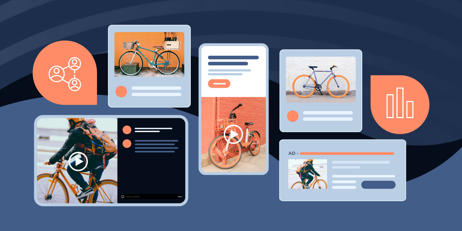 As we approach the halfway mark of 2023, marketers must stay ahead of the curve and adapt their strategies to the ever-evolving landscape of the industry. Q3 is just around the corner, and it presents a unique set of challenges and opportunities that your marketing strategy should be adapting to. To help you navigate this dynamic environment successfully, we will be sharing the latest trends that are shaping today’s marketing landscape. In this trend blog, we will explore three key areas that demand the attention of marketers before the next quarter kicks into high gear. From the rising importance of community marketing to the transformative power of in-person and virtual events, and the integration of AI into organic and paid media, we will delve into the details of each trend, how you can add them to your marketing strategy, and discuss their potential impact on your brand’s success. Trend #1: Community MarketingCommunities have the power to extend your brand’s reach far beyond your immediate customer base. Engaged community members are more likely to share content, engage in discussions, and refer others to join the community. This organic word-of-mouth marketing can result in a significant increase in brand visibility and attract new customers who align with your brand values and offerings. By leveraging community marketing, you’ll tap into the potential of a wider audience. Now, let’s dive into a few different kinds of communities that you may want to think about adopting into your strategy… 3 Kinds of Communities You Can Incorporate into Your Marketing Strategy
Trend #2: In-Person & Virtual EventsIn today’s rapidly evolving landscape, marketers must embrace a dynamic approach to event strategies by adopting both in-person and digital formats to drive success. In-person events enable face-to-face interactions, fostering authentic connections, and leaving a lasting impression on attendees. In-person events offer the opportunity to showcase products, provide immersive experiences, and establish a strong brand presence. On the other hand, digital events break geographical barriers, reaching a global audience and offering convenience and accessibility. They leverage technology to deliver engaging content, facilitate interactive discussions, and provide valuable data and insights. By combining the power of in-person experiences with the reach and scalability of digital platforms, marketers can expand their audience, enhance brand visibility, foster meaningful engagement, and achieve remarkable outcomes. The synergistic effect of these strategies creates a powerful marketing ecosystem that propels brands to new heights in the ever-evolving digital landscape. 3 Ways to Incorporate This Trend into Your Marketing Strategy
Trend #3: AI for Organic & Paid StrategiesAI provides invaluable capabilities that can significantly enhance your marketing efforts. Embracing AI empowers marketers to leverage data-driven insights, automate time-consuming tasks, and make data-informed decisions, leading to more effective and efficient marketing campaigns with higher returns on investment. 3 Ways to Incorporate This Trend into Your Marketing Strategy
In this blog, we have explored three pivotal areas that demand your attention before Q3 takes off. From the growing significance of community marketing to the transformative potential of in-person and virtual events, and the integration of AI into both organic and paid media, we have delved deep into each trend, equipping you with actionable insights to enrich your H2 2023 marketing strategy. By embracing these trends, you will open up new avenues for success and establish your brand as a frontrunner in the ever-evolving marketing sphere. As we move forward, remember that staying ahead of the curve requires ongoing adaptability and a willingness to embrace innovation. By keeping your finger on the pulse of emerging trends and their implications, you position your brand for continued growth and relevance in a rapidly changing landscape. Want to see how Instapage can help you achieve your marketing goals? Schedule a 1:1 consultation with one of our experts today. from The Marketing Method Blog - Instapage https://ift.tt/ReoQcIt Ads Spy Tool - Spy Your Competitors' Ads, Keywords & Creatives https://ift.tt/lw2fevJ Online Money Making Method - https://ift.tt/DZtGYnd Meet Instapages New CEO: Imran Syed Sets the Course for the Companys Next Phase of Development6/20/2023  Team Instapage is thrilled to announce the promotion of Imran Syed to the position of Chief Executive Officer. He brings a deep understanding of the company and the power of Instapeeps, as he previously was the COO and Senior Vice President of Professional Services at Instapage. Syed also brings extensive experience in cultivating high-performing teams and driving remarkable outcomes. This appointment marks an exciting milestone for our team as we enter a new phase of development and growth.
Syed is focused on continuing to raise the bar for Instapage and maintain our position as a category leader. Leveraging his expertise in operations and customer success, Syed’s initial goals as CEO include fostering a diverse and talented team of individuals with unique perspectives and empowering our customers with continuous victories. Syed is also deeply committed to creating meaningful growth opportunities for existing Instapage employees within the organization. Founder and Chief Product Officer, Tyson Quick, commented on the announcement, stating, “I have had the privilege of witnessing Imran’s visionary leadership in action over the past years.” Quick continued, “I am excited to collaborate with Imran to deliver even better results for our valued customers and our company.” Imran Syed’s impressive career includes successful tenures at tech giants such as Oracle where he helped develop the GTM services and success strategy that helped form the Oracle Marketing Cloud (OMC). Within his role as Regional Vice President, he supported the OMC’s global footprint and advised Fortune 1000 organizations on digital transformation, technology investments, and omnichannel experiences. Prior to Oracle, Imran held progressive leadership roles at brands like Eloqua, Disney, and Ontario Power. The appointment of Imran Syed as CEO marks an exciting new chapter in Instapage’s journey. With his exceptional leadership skills and experience, Syed is well-positioned to guide the company through its next phase of development and growth. Our team remains committed to delivering exceptional landing page experiences that drive brand trust, customer loyalty, and conversion rates. Stay tuned for even more exciting developments as Instapage continues to revolutionize the marketing industry. from The Marketing Method Blog - Instapage https://ift.tt/a5bLYQ1 Ads Spy Tool - Spy Your Competitors' Ads, Keywords & Creatives https://ift.tt/2XJ6WVY Online Money Making Method - https://ift.tt/Ak7cGxv |


 RSS Feed
